Understanding your Team Dashboard
The Team Dashboard tracks Regie Co-Pilot personalization activities at the individual rep and team level

Dindo Fernandez
Last Update 5 months ago
For more details on how frequently your team is personalizing using Regie Copilot please see the following link: How to Understand the Personalized Email Score
How to Access you Workspace Team Dashboard
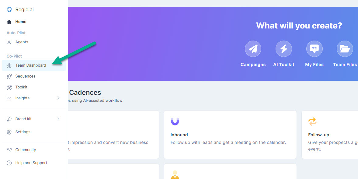
1. Within your Regie platform, go to the Co-Pilot section on the left navigation menu and select Team Dashboard.
2.. Alternatively, these same Personalization Analytics are also accessible by clicking the Chrome Extension icon directly from your browser. Select Analytics from the menu
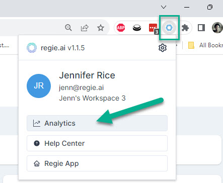
You will then be brought to the Chrome Extension Analytics Dashboard 🎉
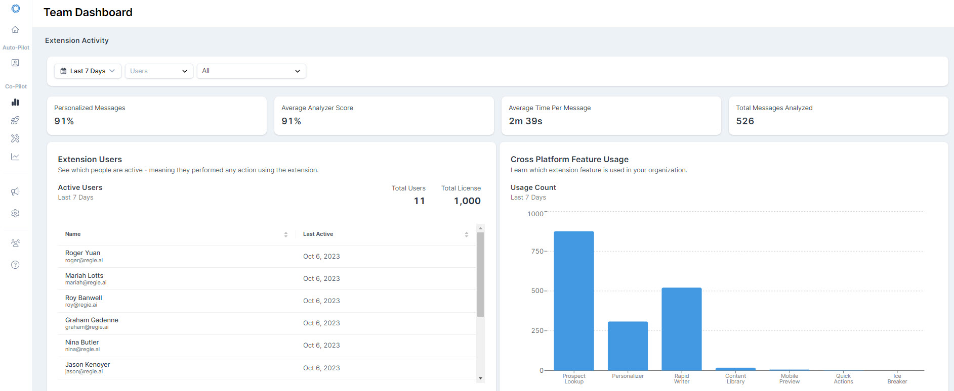
All of the Extension Activity and Email Analyzer Performance data has a default display of Last 30 days. This can be changed by selecting the Timeframe filter on the right side of the page.
Now, let's break down the data and insights!
Filtering the Team Dashboard
Need to narrow your Chrome Extension insights and data on the Team Dashboard? Apply filters to the data based on Date Range, specific Users, and the Platform used to send personalized messages.
Date Range Filter
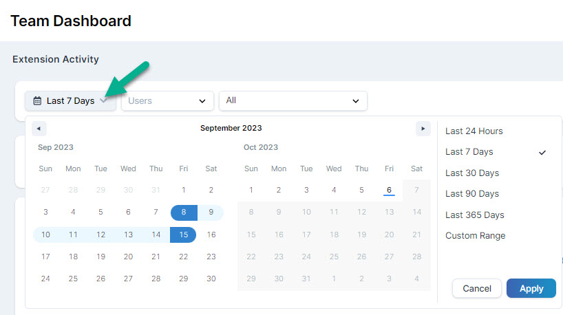
Narrow your focus on a particular date range while analyzing the Extension Activity and adoption of Email Best Practices across your organization.
By selecting the Date Filter, you have the option to review Extension Activity Data from the last 24 hrs all the way up to the last 365 days.
You can also apply a Custom Date Range of your choosing by using the calendar feature and selecting and applying your preference.
Users Filter
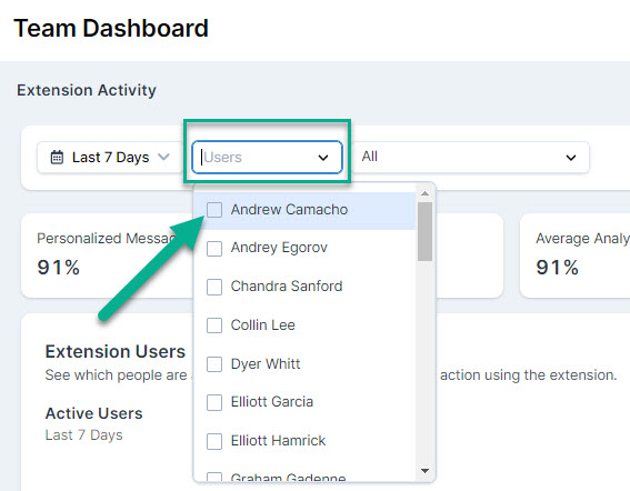
By default, the Team Dashboard will showcase Extension Activity for all Regie Users in the Workspace.
Analyze specific Users by selecting them from the Users drop-down filter. Filter by Users by clicking the square next to their name.
Platform Filter
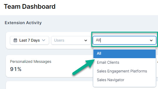
Filter the Team Dashboard based on Chrome Extension usage within specific platforms used to personalized messages. By default, the Dashboard will show personalization data for all platforms listed below:
- Sales Engagement Platforms
- Email Clients (Gmail and Outlook)
- Sales Navigator
Tracking Overall Utilization
On the left side of the screen, you’ll find your users Extension Usage Activity.
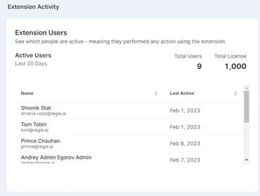
This section will let Leaders know which Users are actively using the Chrome Extension and the total number of Licenses you have with Regie.
The Active User Data here are as follows:
- Total Number of Active Users during a specified timeframe.
- List of Active Users and the Date they Last Used the Chrome Extension during a specified timeframe.
Tracking Specific Feature Usage
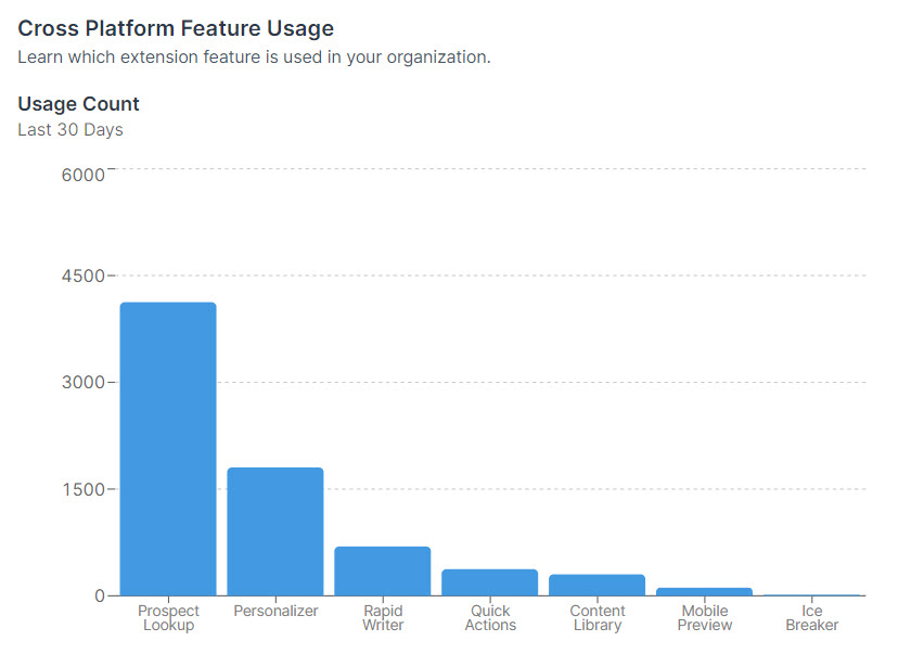
Specific Chrome Extension feature utilization is tracked here.
Hovering your mouse over any feature usage bar and clicking it will also showcase who exactly used the feature, and the number of times used.
- Prospect Lookup = The number of email addresses enriched to get detailed work, personality, and communication style data, through the Prospect Lookup feature.
Why this is helpful: Using this feature helps your outbound team generate emails that are relevant to the prospect.
- Personalizer = The number of times the Personalizer was used to create an Intro Line or entire, personalized email from the prospect’s data and your value proposition.
Why this is helpful: Using this means spending less time writing relevant, personalized emails.
- Rapid Writer = The number of times the Rapid Writer feature was used for sending a personalized outbound message.
- Quick Actions = The number of times the actions within the “Quick Actions” menu were used. This Quick Actions menu appears when highlighting text and can include rephrasing, shortening, or expanding the content selected.
Why this is helpful: Using these quick actions helps save time editing the context of your message while crafting an effective email.
- Content Library = The number of times the Content Library was opened to insert value propositions, pain points, or other data from the CMS.
Why this is helpful: More use of the CMS means email writers are spending less time writing emails, and also staying on-message using enterprise wording.
- Mobile Preview = This counts the number of times the Mobile Preview tool was used to check how the email will be viewed on mobile.
Why this is helpful: Many emails are opened on mobile - between 50 and 70%. Having a short, easy-to-read email on mobile is effective and important.
- Ice Breaker = This counts the number of times the Ice Breaker feature was used while personalizing their outbound emails.
Why this is helpful: Using this means your outbound team is going deeper with their personalization efforts while crafting messages to prospects.
- LinkedIn Connection Request = This counts the number of LinkedIn Connection Requests Tasks marked as complete using the Power Socializer.
- LinkedIn InMail = This counts the number of LinkedIn Messages and InMail Tasks marked as complete using the Power Socializer.
Why are these LinkedIn insights helpful: Using these features means that your outbound team is accelerating their LinkedIn social prospecting and sending relevant, personalized messages to prospects.
Email Analyzer Performance
You can track your organization's Email Analyzer Scores and the exact number of times users in the organization were offered Recommendations to improve their emails.
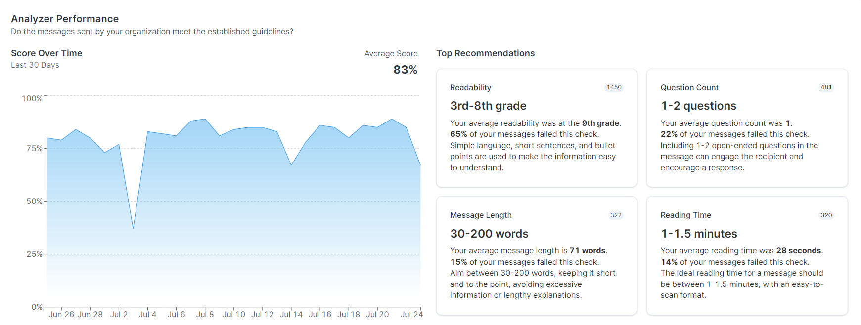
- On the left, you can track the Email Analyzer Score Overtime and the Avg Email Analyzer Score based on all emails analyzed and sent during the selected timeframe.
- The right side of the page highlights the Top Recommendations given to a specific user or the organization by the Email Analyzer.
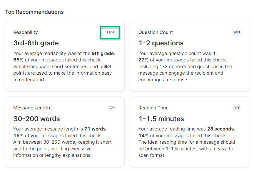
The numbers on the top-right of each recommendation represent the number of times a specific user or the organization was prompted for these industry best practice suggestions.
Leaderboard
And last but not least, there's a personalization Leaderboard of all the users in the Workspace.
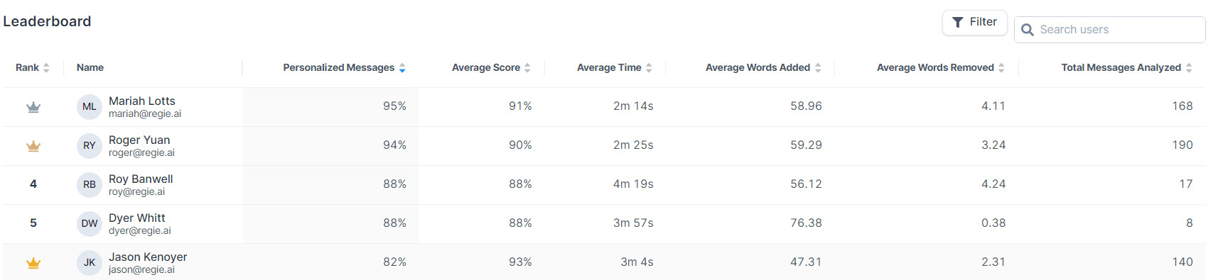
- Click on any of the header columns in the Leaderboard to sort the data.
- Select any user by name to analyze user-specific personalization analytics, plus see a detailed breakdown of all the emails they've sent and best practices that were followed.
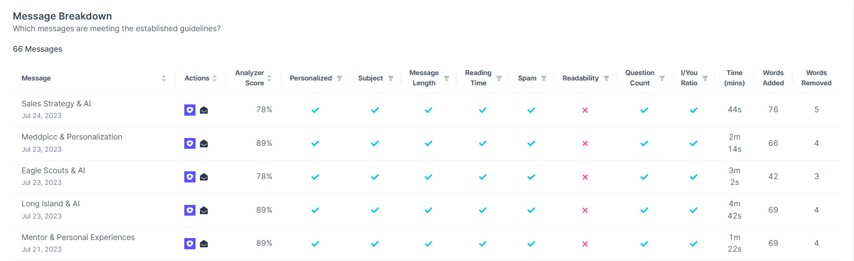
- Green Check = the email writing best practice was followed by the user. Excellent Work!
- Red X = a best practice that wasn't followed. This reveals a coaching opportunity especially if there is a consistent pattern of not adhering to certain emailing best practices.
Managers can click on the platform icon used by the user to send the email. This will automatically give the opportunity to see the exact email content and details to whom the email was sent.
Quick Note: Inspecting and the content of emails sent from an Email Client (Gmail or Outlook) is not available.